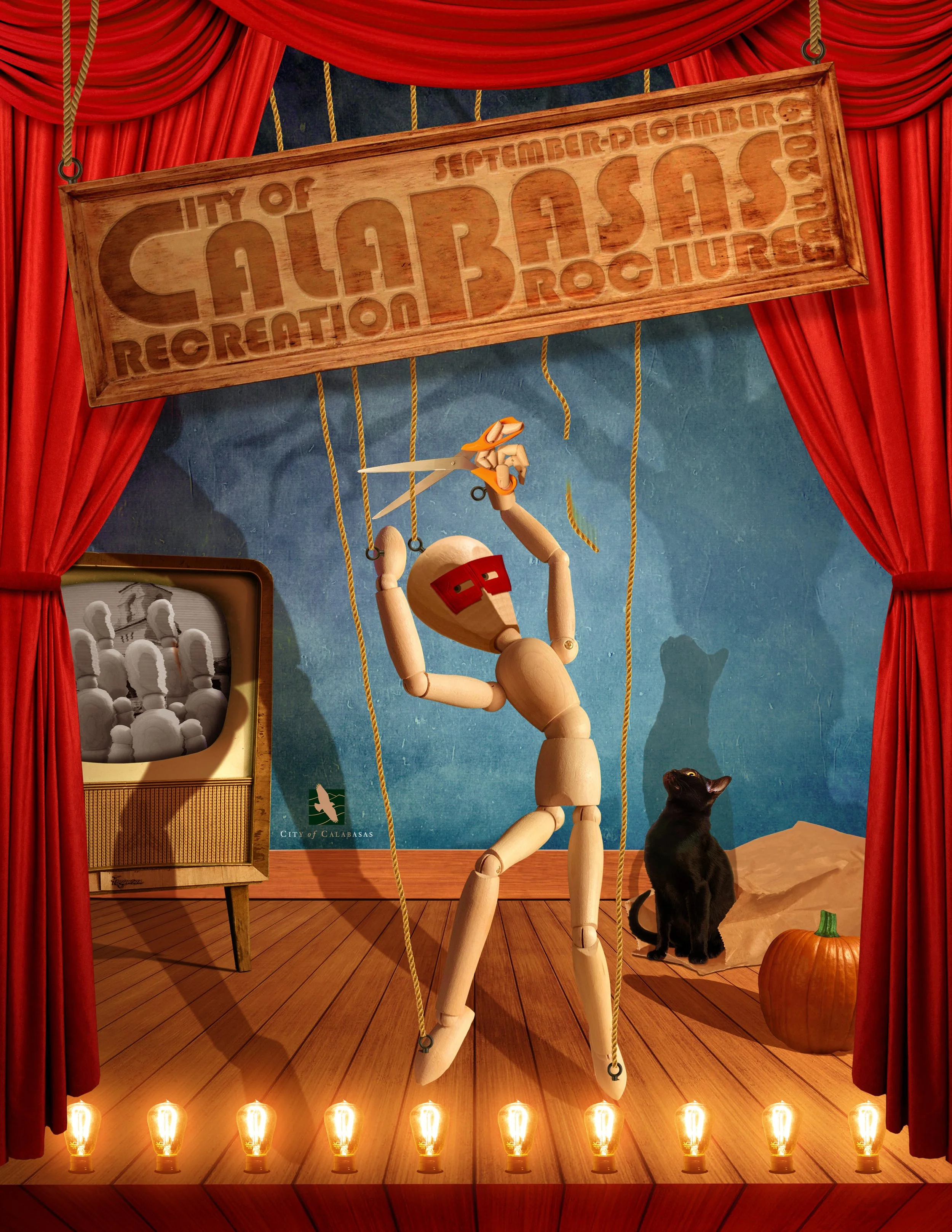
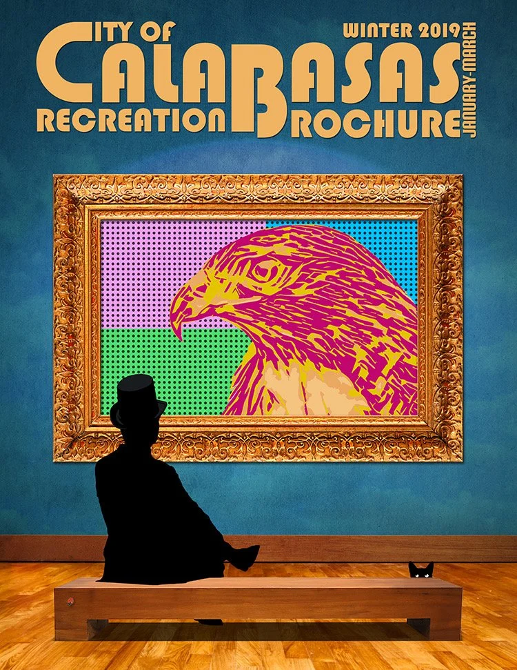
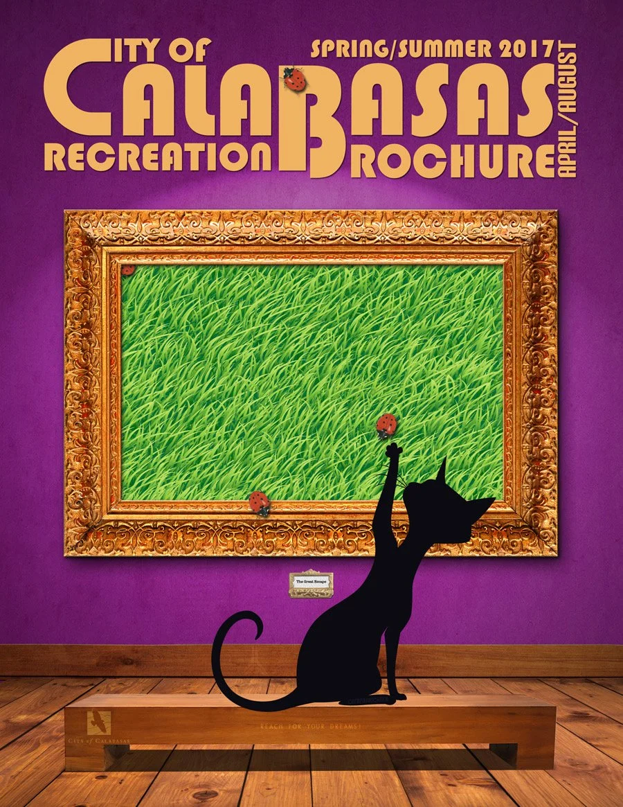
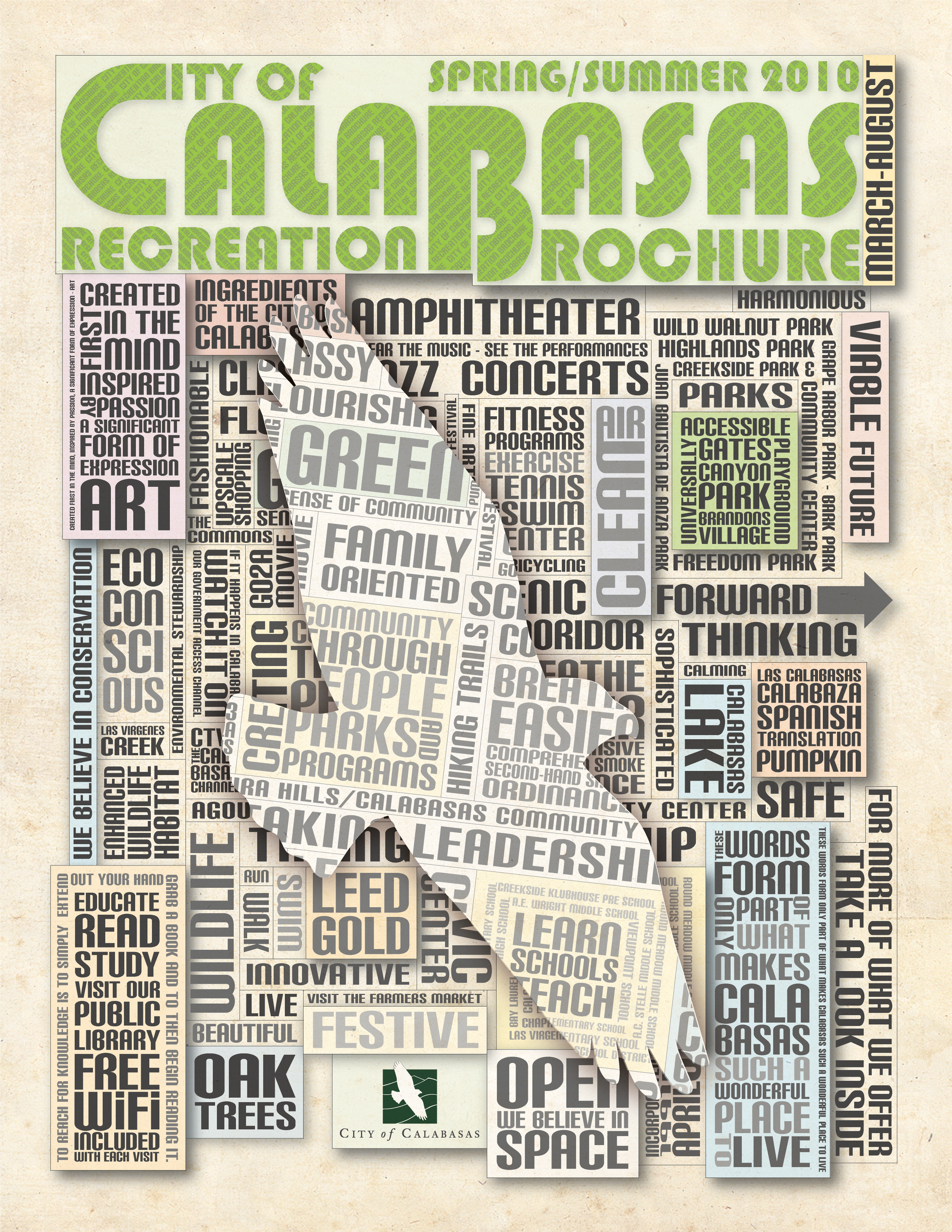
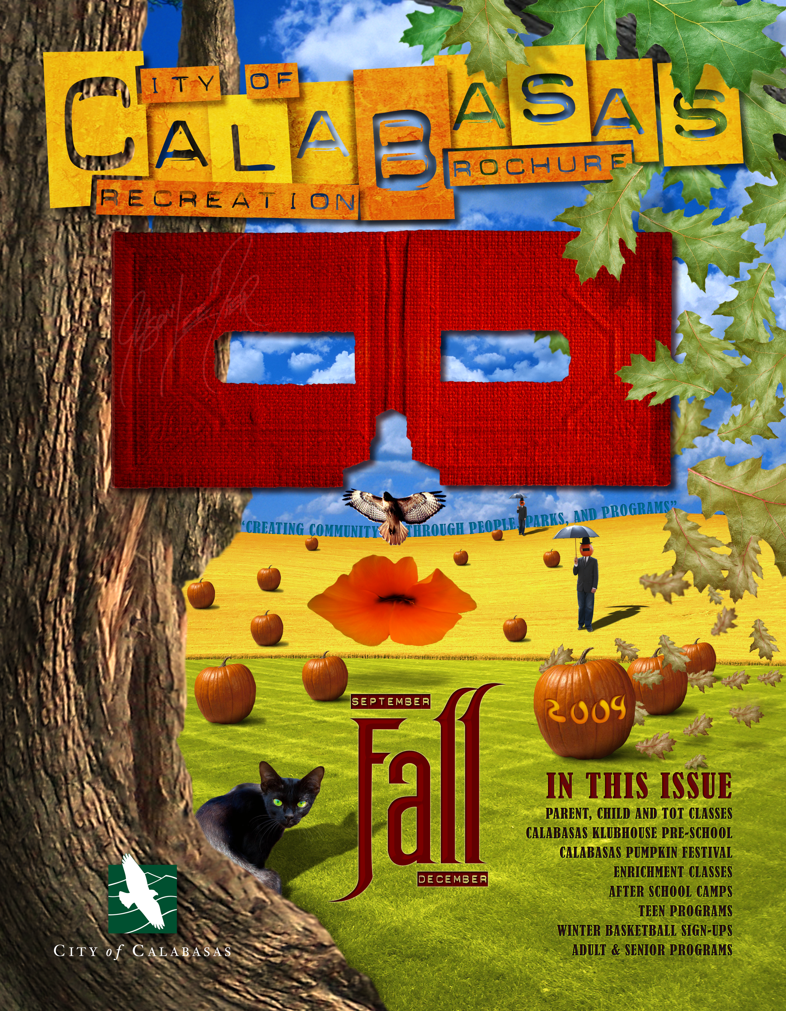
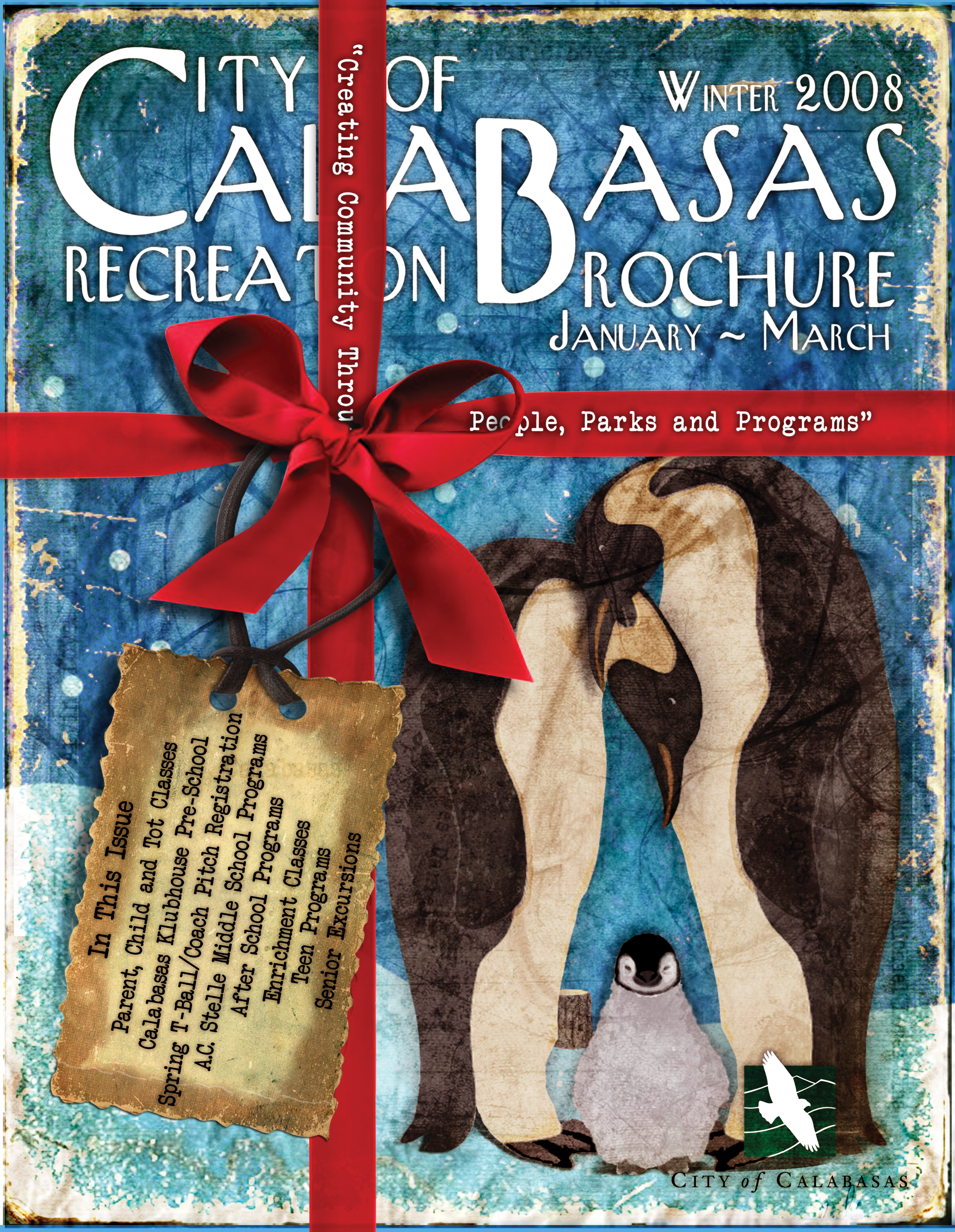
Each cover functions as a visual entry point into the season, using bold typography, playful symbolism, and shifting illustration styles to reflect the rhythm of life in Calabasas throughout the year. Rather than relying on literal imagery of activities, the designs lean into mood and metaphor. Gallery frames elevate everyday experiences, recurring silhouettes and objects suggest imagination and community, and seasonal elements anchor each issue in time while maintaining a cohesive identity across the series.
The result is a unified body of work that balances clear civic communication with personality and warmth. The approach proved successful not only in redefining the visual tone of the brochure, but in its reception. The designs were embraced by city leadership and found their way into the hands of residents, reinforcing their role as a shared point of connection within the community.
Most importantly, the brochures succeeded in doing what they were designed to do: feel inviting, memorable, and worth opening.